
BRIEF:
Arthin is another name of “Hanuman”, who as we all know, is the symbol of strength and loyalty. Arthin Capital is an investment banking firm (key) that’s loyal to its customers (Hanuman’s Gada) and whose main motto is to help their customers grow (ever increasing circles). The colours and the clean look depict professionalism and their no-nonsense attitude.
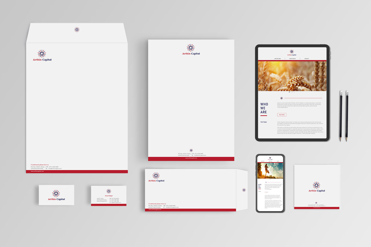
This is what happens when a group of young, highly qualified investment bankers come together. They form a new venture that is strong, dynamic and focussed, just like them.
They mean business here.

The logo is dynamic and always evolving, just like their motto. The dynamic logo is used on the website as well as the social media.

The website design is the highlight of the branding with bold typography and detailed icons to explain what and how they work with their clients. The images and the colours all work together cohesively.