
STORY:
Eat Easy is a ready to cook dehydrated Indian vegetarian product that transforms into a tasty meal in 5 minutes. Their target audience is mainly Students or businessmen who travel abroad and want to have delicious Indian food on the go.
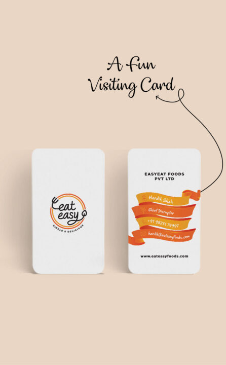
To appeal to the dashing target audience, the branding conveys a friendly, easy going vibe with hand-drawn elements. We have bright colours to match the company’s USP: easy cooking on the go! Even the instructions were given in a friendly fun manner.
Simple, easy, fun!
Nothing says easy and simple as a handcrafted, handwritten logo. The fork and spoon merge seamlessly in the logo to depict the ready to eat feature of the product.
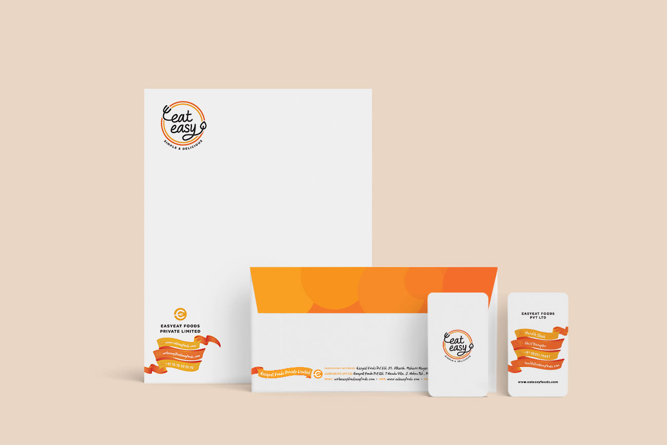
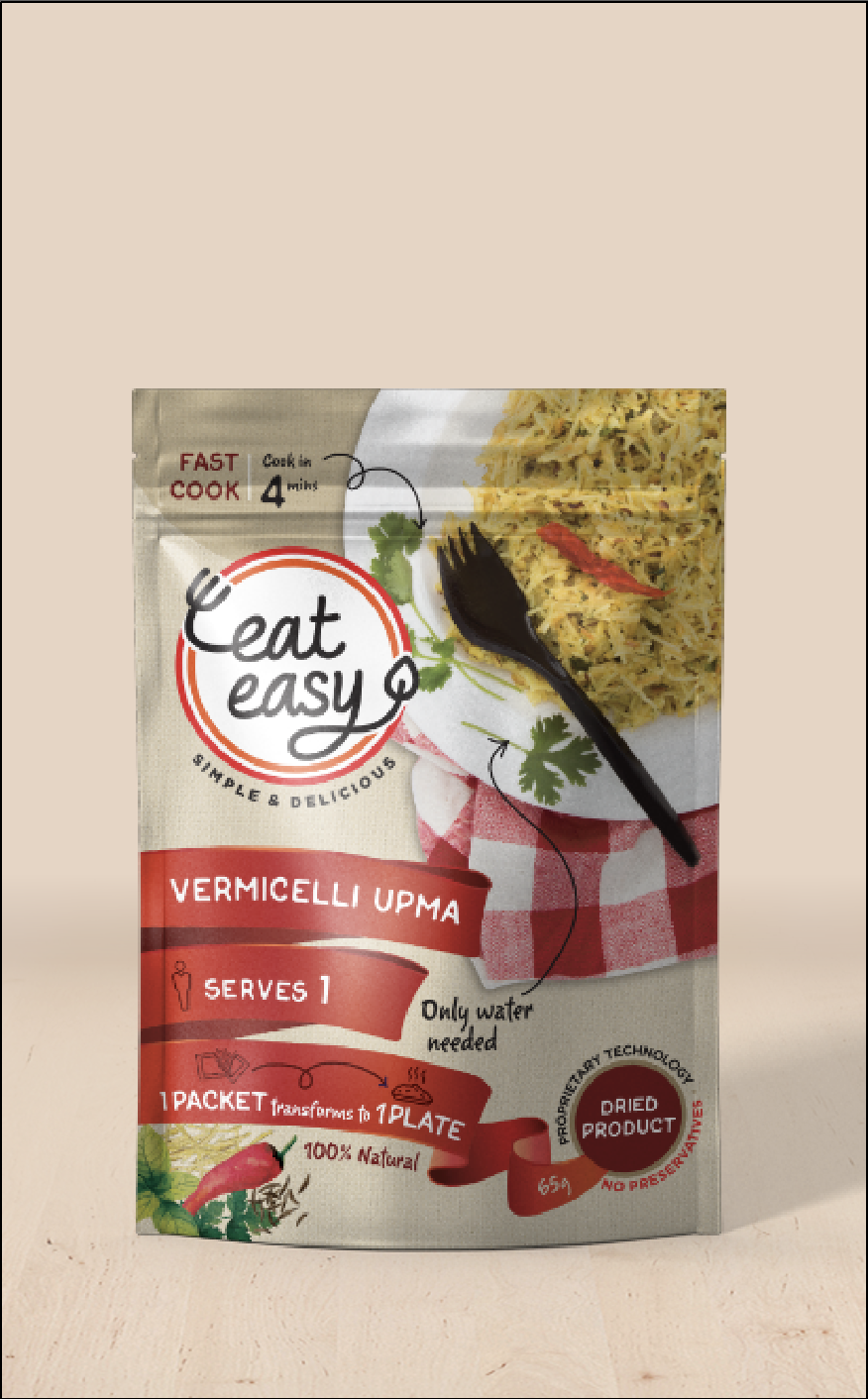
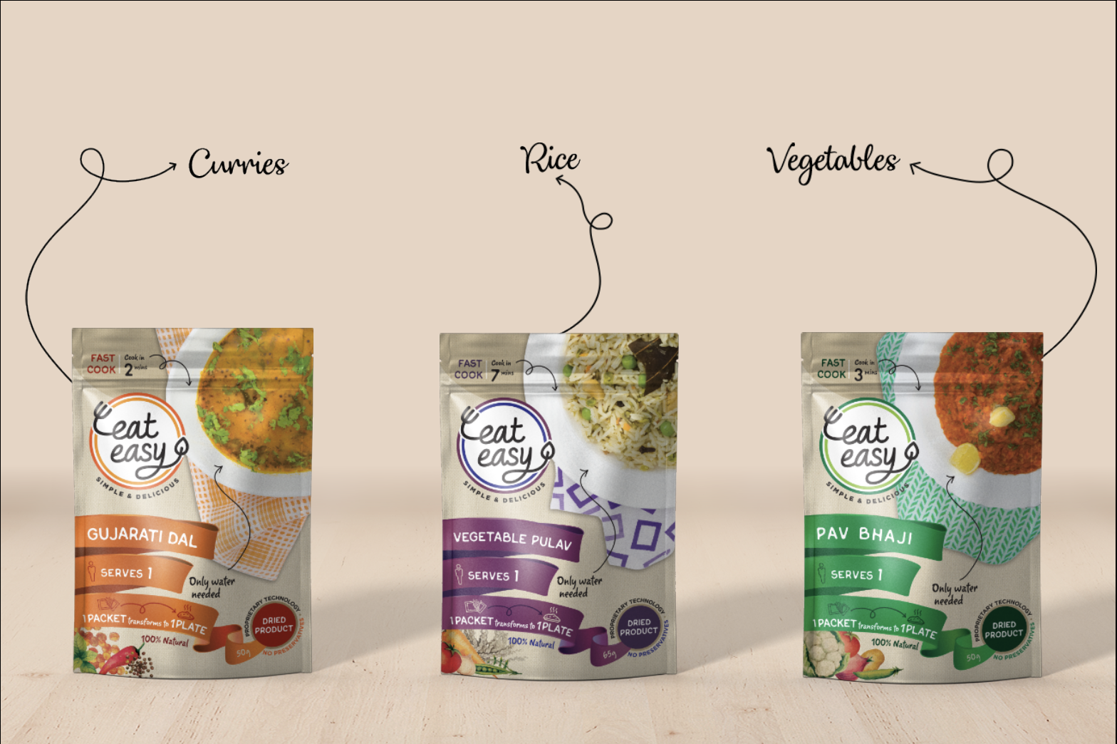
And oh! We colour coded the packs! Orange for dals, green for curries, purple for rice, red for breakfast and blue for desserts. The logo, the photography and even the cutlery was art directed to compliment these colour system.
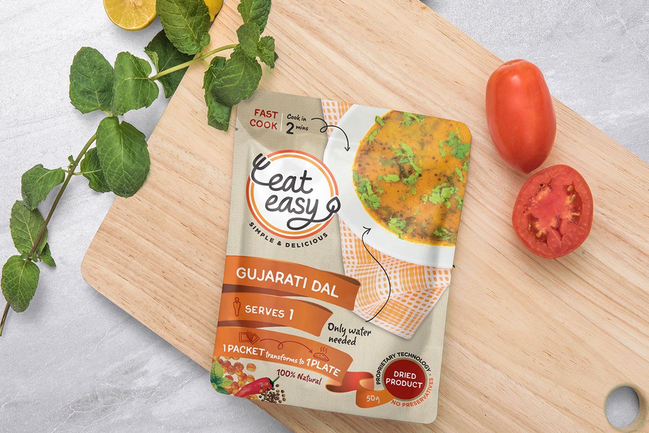
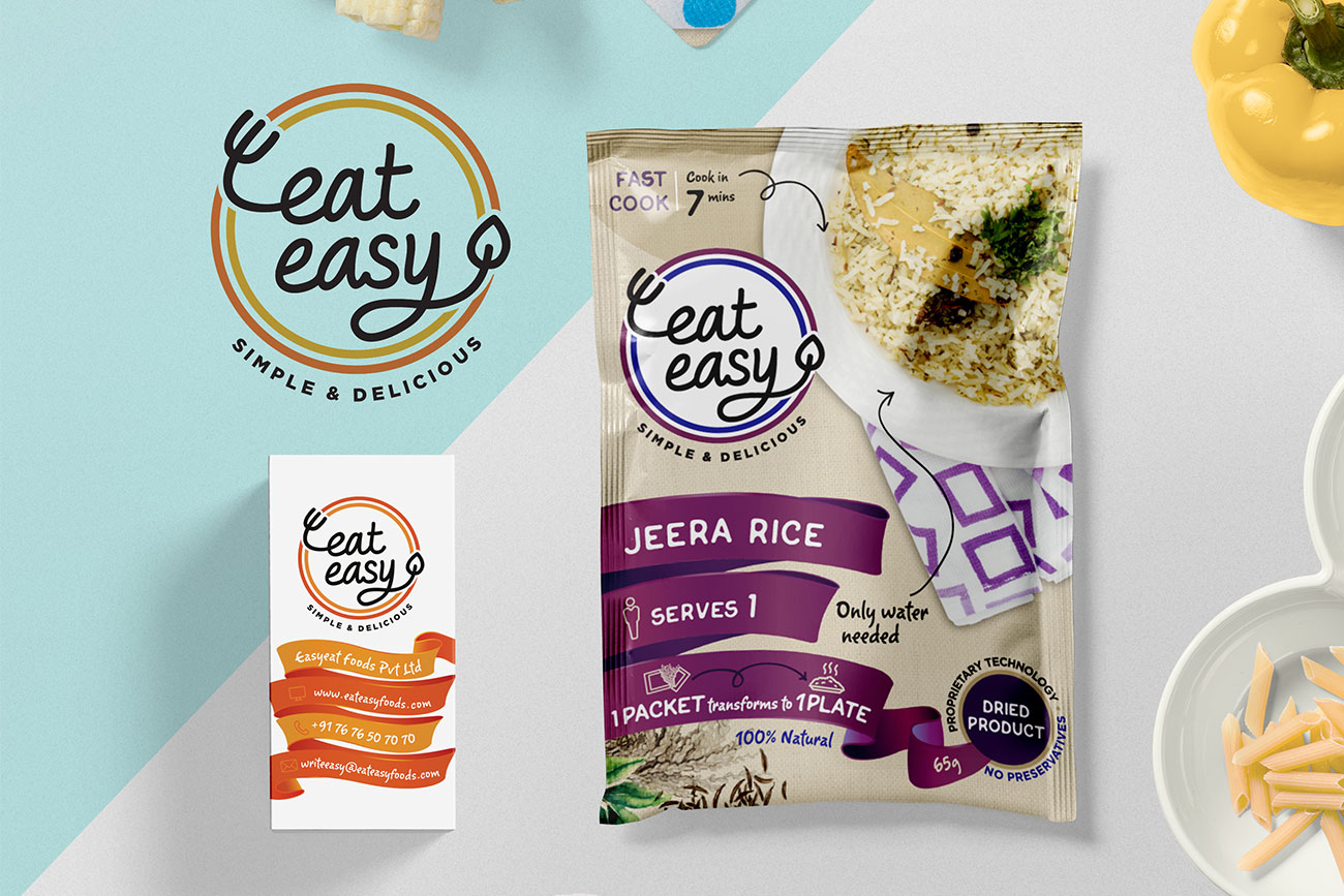
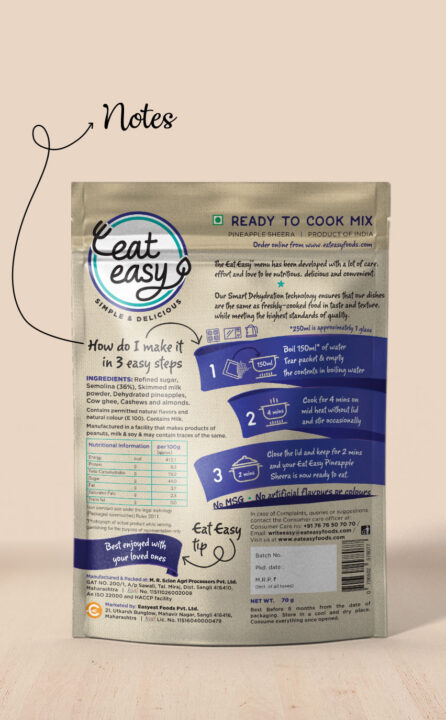
We used small humourous handwritten notes to create a young vibe for the packages
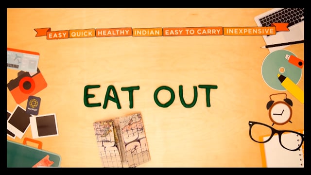
The stop motion video is an introduction to the products and also shows how to prepare the food in a fun, quirky manner that appeals to our young audience.