
BRIEF:
𝘖𝘯𝘦 𝘯𝘢𝘮𝘦, 𝟸 𝘴𝘪𝘴𝘵𝘦𝘳 𝘤𝘰𝘮𝘱𝘢𝘯𝘪𝘦𝘴. 𝘖𝘯𝘦 𝘭𝘰𝘨𝘰, 𝟸 𝘪𝘥𝘦𝘯𝘵𝘪𝘵𝘪𝘦𝘴.
𝘖𝘯𝘦 𝘐𝘯𝘥𝘪𝘢𝘯, 𝘵𝘩𝘦 𝘰𝘵𝘩𝘦𝘳 𝘈𝘮𝘦𝘳𝘪𝘤𝘢𝘯.
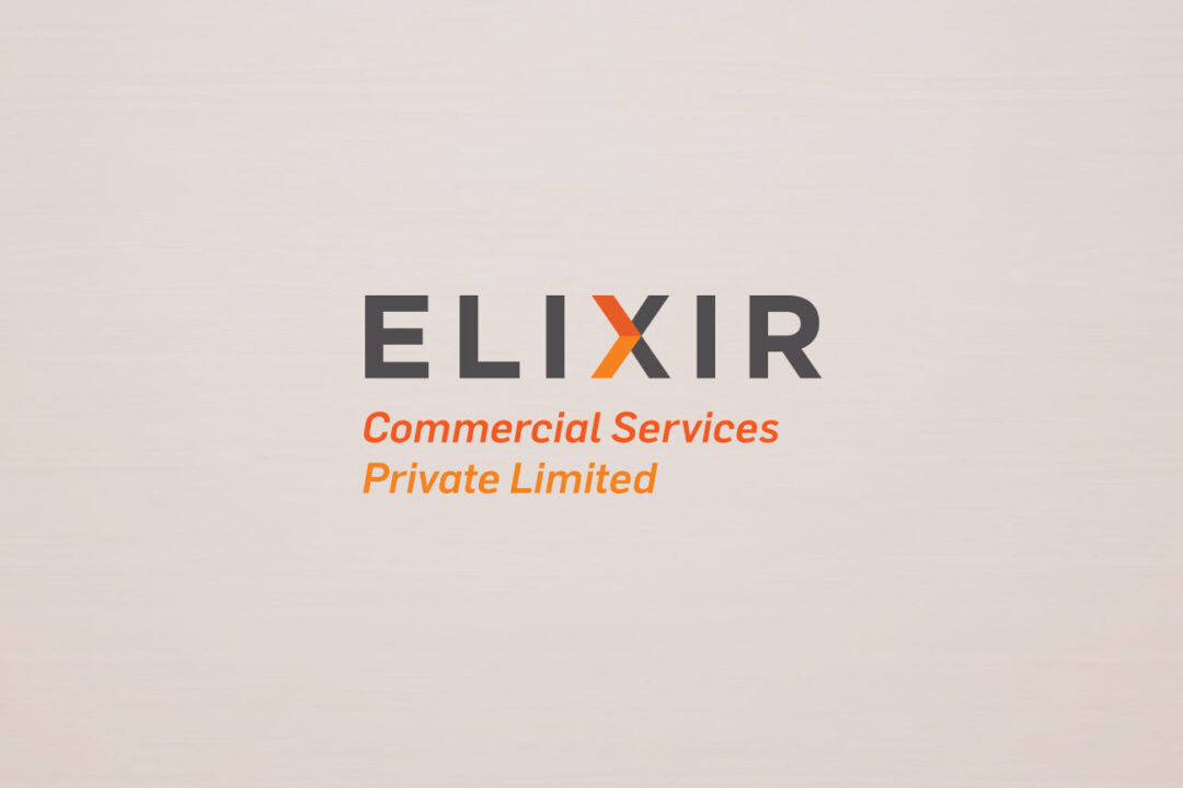
This was an unusual logo brief for a management consultancy firm and an offshore staffing firm called 𝐄𝐋𝐈𝐗𝐈𝐑
A simple, smart, cohesive corporate identity that would be spread across varied media and appeal to Indian as well as International mindsets.
We designed 𝐄𝐥𝐢𝐱𝐢𝐫 𝐂𝐨𝐦𝐦𝐞𝐫𝐜𝐢𝐚𝐥 𝐒𝐞𝐫𝐯𝐢𝐜𝐞𝐬 𝘢𝘯𝘥 𝐄𝐥𝐢𝐱𝐢𝐫 𝐀𝐬𝐬𝐮𝐫𝐞𝐝 Logo Identity based on the common goal they had : 𝐇𝐞𝐥𝐩𝐢𝐧𝐠 𝐭𝐡𝐞𝐢𝐫 𝐜𝐥𝐢𝐞𝐧𝐭 𝐜𝐨𝐦𝐩𝐚𝐧𝐢𝐞𝐬 𝐦𝐨𝐯𝐞 𝐟𝐨𝐫𝐰𝐚𝐫𝐝. Hence the forward arrow. We assigned separate colour palettes for both to create the distinction.
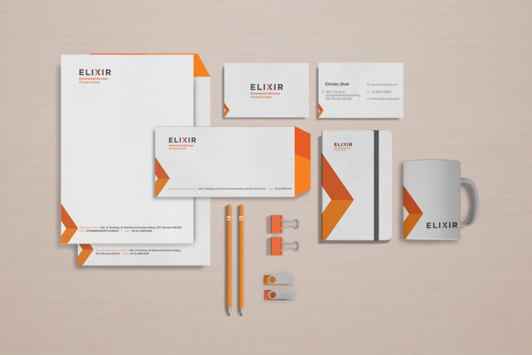
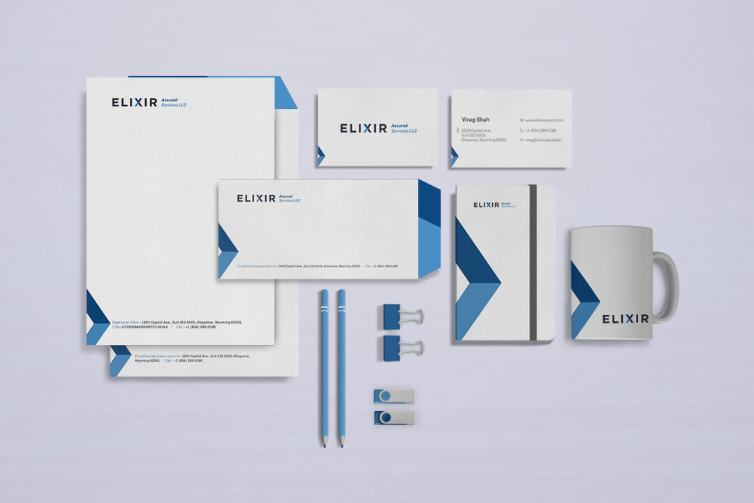
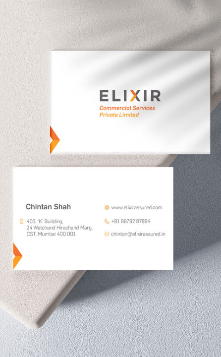
The visiting card with their unique arrow mark to keep it striking, interesting yet understated.
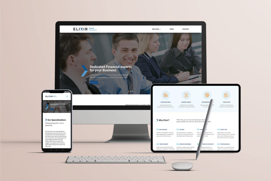

We designed and developed the website that’s professional yet interesting with the use of interactive icons.